Create/View My Reports
Create/View My Reports
-
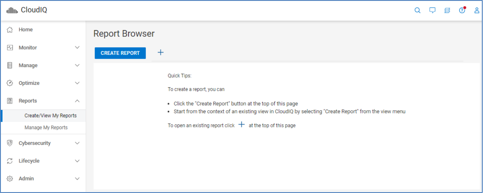
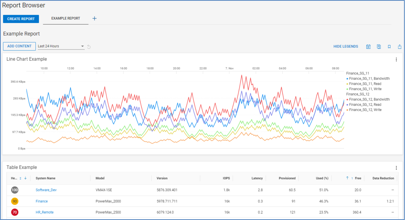
The Report Browser is accessed from the Create/View My Reports menu. It acts as a user’s reporting workspace and dashboard. It allows users to create, view, and modify reports. Reports can be scheduled, duplicated, bookmarked, and exported in PDF format. Reports can consist of any combinations of tables and line charts.
The CREATE REPORT button is used to create a report. The plus icon is used to add an existing report to the dashboard.
A default name is given to a new report. To edit the name, select the edit icon next to the report name. The icon becomes visible when the mouse is moved over that area. To remove the report from the Report Browser, select the X icon. Removing the report from Report Browser does not delete the report. It is still available from All Reports which is discussed in Manage My Reports.
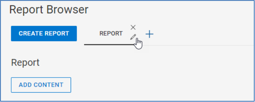
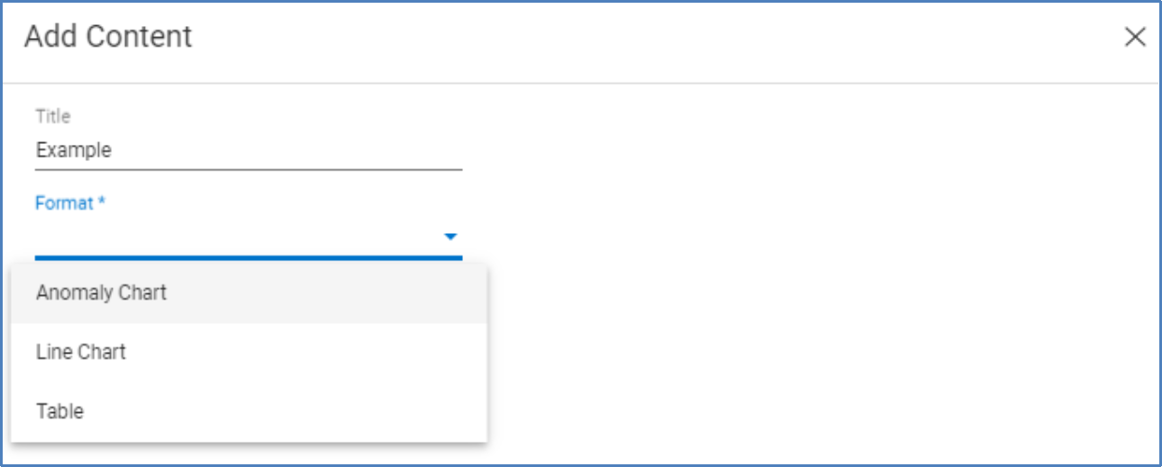
The ADD CONTENT button is used to add tables and charts to the report.
It opens the Add Content window shown here. This window presents a series of drop-down menus to define the content including the format. The remaining menus differ based on the selected format.
Tables
A table allows the user to select one of the following categories:
- Data Protection System
- Filesystem
- Host
- MTree
- Network System
- Pool
- Replication
- Server
- Data Reduction Storage System
- Server Firmware
- Storage System
- Virtual Machine
- Volume
- HCI System

When the user selects the Category, a list of available and selected columns is displayed. CloudIQ prepopulates the report with common columns. The user can either drag and drop or double-click a column name to add or remove it.

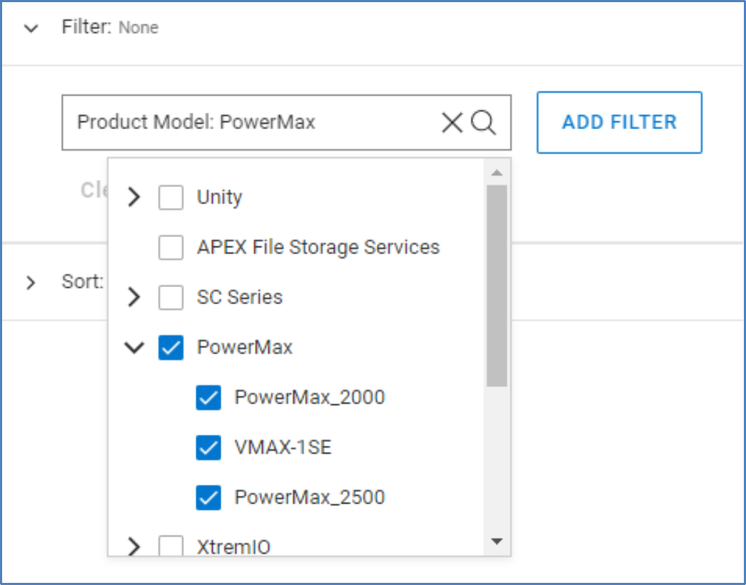
The next section is the filter. The user can select in the Search Filters field and scroll through the full list of columns, or they can begin typing to find a specific one. When the column is selected, the user can choose from an applicable value. The following example shows a filter on the Product Model column and then on all PowerMax systems.
Users can display custom tags in their reports and can use filtering to create reports specific to custom tags such as applications or business units. See the Custom Tags section for more information.
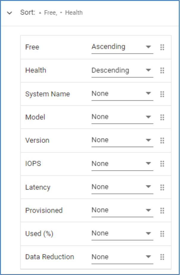
The final section is Sort. Sort allows the user to add one or more columns to sort the table. Sort columns can be ordered by dragging and dropping the columns to the preferred sort order.
In this example, the first sort is an ascending sort based on Free capacity. The second sort is a descending sort on Health Score.
Line charts
A line chart requires the user to select the Product, Category, System, and Metric. If the chosen category is System, the System selection is not necessary. Once the chosen metric is selected, the user selects which Objects to including in the chart.
Metrics available for line charts are shown in Appendix D: Report Browser metrics.
This example shows the configuration of a chart that includes various read/write metrics for the Finance_SG_11 and Finance_SG_12 storage groups.

Anomaly charts
Anomaly charts are like line charts. The list of supported products is currently restricted to the following:
- APEX Block Storage Services
- Connectrix
- PowerMax
- PowerStore
- PowerVault
- SC Series
- Unity XT
- VMware
Anomaly charts provide both the value of the metric and the historic seasonality. This allows users to identify any unexpected anomalies or changes in patterns. Anomaly charts show up to 24 hours of data.
Report options
When a report is created, there are several options that are available for the user at the report level.
- HIDE LEGENDS – For line charts, it provides the option to hide the legend of each object on the right side of the chart. The legend shows the data timestamp and value for each object as the user hovers over the chart. The legend also serves as a filter to remove metrics from the chart.
- Schedule: Schedules the report. Choose initial runtime and one of the following intervals: Daily, Weekly, Bi-weekly, Monthly, or Quarterly. Choose format of PDF or CSV. Enter email addresses for recipients.
- Duplicate: Creates a duplicate copy of the report in the Report Browser. This is used to create multiple similar reports where the user wants to make minor changes to a report.
- Bookmark: Adds or removes the bookmark on the report. Bookmarks allow the user to easily find and view the report in the Report Browser from the Add Report icon.
- Export PDF: Exports the report in PDF format.
The time range of line charts is set to Last 24 Hours by default. It can be changed to another preset value or a custom range using the pull down.

Chart and table options
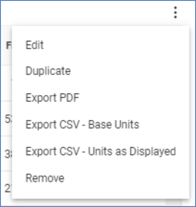
For each individual chart or table, the user is presented several options after selecting the options icon (
 ).
).- Edit – Modify the individual chart or table.
- Duplicate – Create a duplicate chart or table in the same report.
- Export PDF – Exports the individual chart or table in PDF format.
- Export CSV – Base Units. Exports the individual table in CSV format.
- Export CSV – Units as Displayed. Exports the individual chart or table in CSV format using scaled values shown in the table.
- Remove – Deletes the chart or table.