
PowerFlex Historical Reporting
None
None
-
The enterprise capacity dashboard consists of five charts (Figure 18). The layout of the dashboard has a logical flow from left to right. The first bar chart is Raw Capacity Usage and normalizes the raw capacity of all PowerFlex clusters discovered in SRM. Details of the configured usable capacity are explained in the Usable Capacity chart. The used capacity is detailed in the Used Capacity by Type chart.
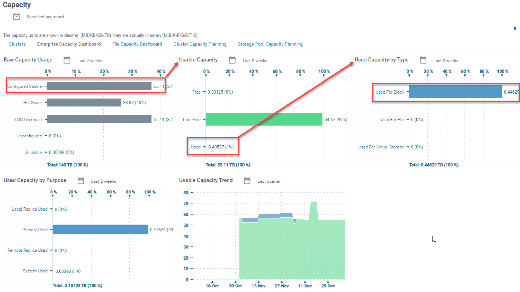
Figure 18. PowerFlex Enterprise Capacity